Create simple CSS only animated loader
Create simple CSS only animated loader looking like spinning circle, which is commonly used to indicate user that something is loading or getting ready.
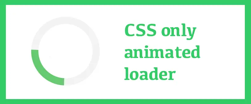
What is it going to look like
HTML sructure
<div class="loader"></div>
- The <div class="loader"></div> creates a div element with the class loader, which we will style to look like a spinning circle.
CSS Styles:
  .loader {
    border: 7px solid #f3f3f3;
    border-top: 7px solid #33cc66;
    border-radius: 50%;
    width: 40px;
    height: 40px;
    animation: spin 1.2s linear infinite;
    margin: auto;
  }
- .loader: This class is used to style the loader.
- border: Creates a solid border with light grey color.
- border-top: Creates a colored border at the top to make the spinning effect visible.
- border-radius: Makes the div a circle.
- width and height: Set the size of the loader.
- animation: Applies the spinning animation with a duration of 2 seconds, linear speed, and infinite repetition.
- margin: Center the loader on the screen.
@keyframes spin:
  @keyframes spin {
    0% { transform: rotate(0deg); }
    100% { transform: rotate(360deg); }
  }
- Defines the spinning animation.
- 0% { transform: rotate(0deg); }: Starts the animation at 0 degrees.
- 100% { transform: rotate(360deg); }: Ends the animation at 360 degrees, creating a full rotation.
Feel free to customize the size, color and speed of the loader by modifying the CSS properties.